

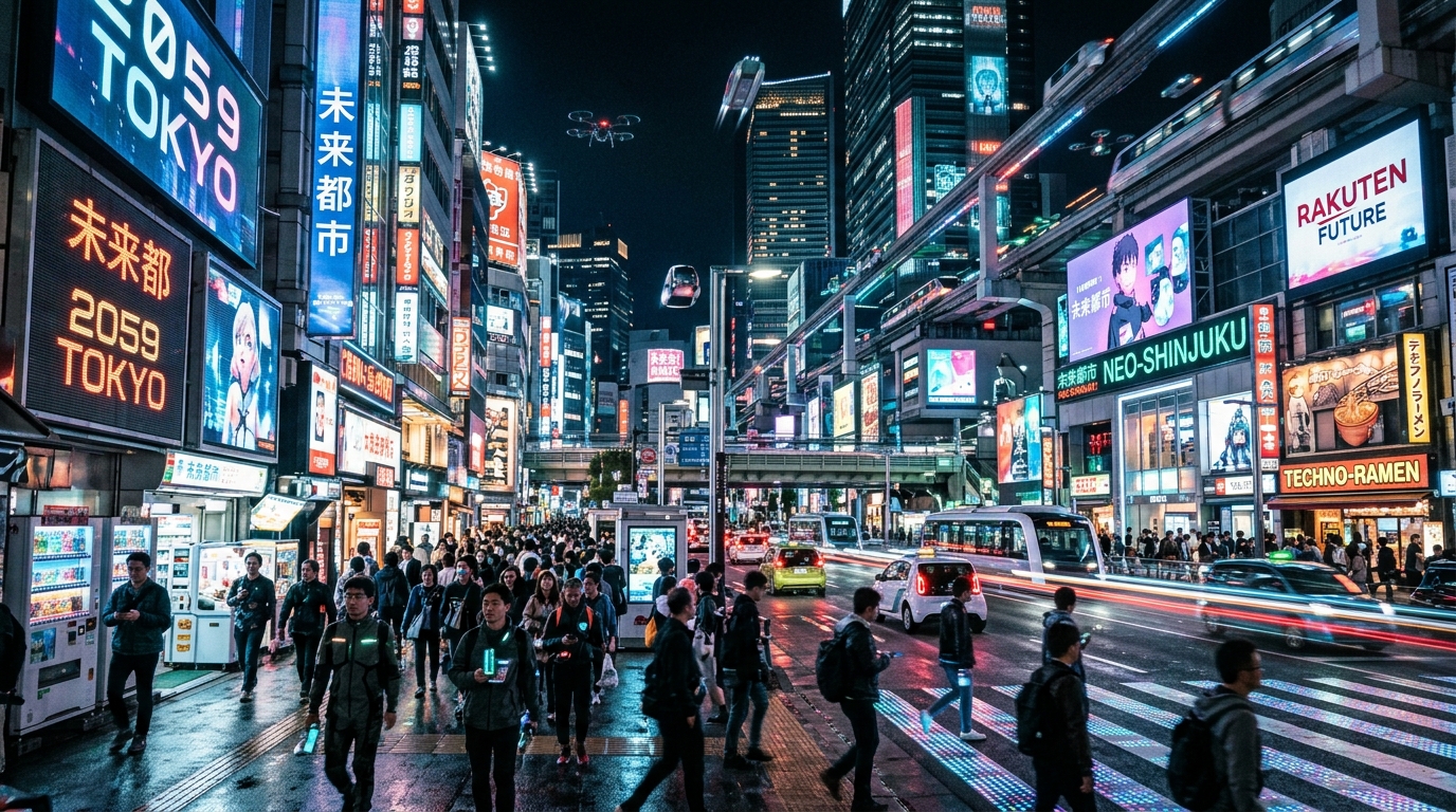
A Practical Guide to Getting Better Results from GPT Image 2
Image generation is more reliable when a prompt begins with a clear visual brief rather than a broad request. Before using GPT Image 2, decide what the image should show, what is happening, where it takes place, and what mood it should convey. Also consider its intended use: a product listing, editorial illustration, presentation slide, or social post may call for different levels of detail and different framing.
Concrete descriptions give the model useful visual anchors. “A red ceramic teapot on a sunlit kitchen table” identifies an object, material, color, and setting; “a nice kitchen scene” leaves many choices open. Add only details that help define the result, such as steam rising from the spout, a linen cloth nearby, or warm morning light. When a particular feature is essential, state it plainly and early. Distinguish must-have elements from optional atmosphere so decorative suggestions do not compete with the main subject.
Composition deserves the same precision. Specify whether the image should be a close-up, medium shot, or wide view, and describe the viewpoint. For example, eye level, overhead, or from slightly below. Explain where the subject should sit in the frame, such as centered or positioned to the left with open space for text. Name the orientation and aspect ratio when they matter: a vertical portrait for a phone screen, a square crop for a profile image, or a wide landscape image for a banner.
A useful prompt does not need to be long; it needs to make priorities legible. Avoid instructions that contradict one another, such as asking for both a tightly cropped close-up and the entire room in view. Likewise, do not pile on competing lighting, style, or mood directions. If the image must feel calm and natural, choose details that support that goal. A focused brief gives the model fewer conflicting decisions, making results easier to evaluate and refine.
Give the model a clear visual language by describing the medium, genre, era, palette, and degree of realism you want. Instead of relying on a label such as “cinematic” or “vintage,” explain the visible qualities behind it: for example, a 1970s editorial photograph with subtle film grain, muted colors, and naturalistic detail. Specify whether the result should resemble a hand-painted illustration, a studio product photograph, or a realistic documentary image. These concrete cues help guide the image toward a consistent look. If references are available, describe what to take from them, such as their composition, texture, or color treatment, rather than asking the model to imitate them generally.
Lighting descriptions can substantially change the mood and legibility of an image. State where the light comes from, such as a large window on the left, overhead studio lights, or low evening sun, and whether it is soft and diffuse or direct and sharply defined. Include color temperature when it matters: warm amber light can suggest a cozy interior, while cool blue illumination may feel clinical or nocturnal. Mention the shadows you want, including their length, softness, and direction. Time of day is another useful cue; dawn, midday, and dusk imply different light angles, contrast, and atmosphere. Combining these details gives the model practical guidance instead of an open-ended mood word.
Describe materials by their observable properties. Brushed metal has fine directional marks and restrained reflections; translucent glass reveals softened shapes behind it; rough linen shows an uneven weave. Such details can make objects feel distinct and help prevent surfaces from appearing uniformly smooth or glossy. Choose a restrained palette by naming a few dominant colors and, if useful, one accent color. For example, specify cream, charcoal, and muted sage with a small copper accent, rather than requesting every color at once. Keep the directions cohesive: a small set of compatible choices usually produces a more legible result than stacking unrelated stylistic adjectives. If details compete, prioritize the qualities most important to the intended image.
Improve image accuracy by deciding which details matter most before writing the prompt. Identify the subject, its defining features, and any objects or actions that must be correct; give these points priority over decorative background information. A crowded scene creates more opportunities for misplaced, duplicated, or distorted elements, so include only background objects that contribute to the intended image. Describe spatial relationships directly: specify what is in front of, behind, beside, or above something else. State exact counts where they matter, and clarify poses, proportions, and orientation. For example, distinguish a person standing with both hands visible from one leaning on a table, or specify that a small cup sits to the left of a large book.
When an image needs lettering, provide the exact wording, including punctuation and capitalization, and explain where it should appear. Add useful typographic guidance, such as a bold sans-serif headline centered at the top or small white labels beneath each icon. These instructions can improve placement and style, but they do not guarantee flawless text. Small lettering, long phrases, and dense layouts remain unreliable and may require correction in an image editor or replacement during post-production. If precise legibility is essential, keep the text brief, allocate generous space around it, and check every character in the generated result before using the image.
Describe unwanted elements plainly when their absence is important, but keep the prompt centered on the desired image rather than building a long list of exclusions. Positive instructions, such as “a clean tabletop with one ceramic bowl”, usually communicate the goal more clearly than repeated prohibitions. After generation, inspect anatomy, including hands, joints, facial features, and the number of visible limbs. Check that objects have plausible shapes, that perspective and scale agree across the scene, and that repeated items remain consistent. Finally, review the composition at its intended display size: verify that key details are visible, edges are not unintentionally cropped, and any lettering is legible. Revise the prompt around specific errors, changing only the instructions needed to address them.
Start with a clear first-generation prompt based on the brief, then evaluate the result before making changes. Compare the image with the intended use and identify what works as well as what falls short. A useful review considers whether the subject is correct, the visual hierarchy is clear, and the image communicates the intended mood. Avoid treating every imperfection as equally important; choose the mismatch that most affects the result.
Request a targeted revision that addresses that priority while preserving successful elements. If the composition is strong but the lighting is too harsh, ask for softer lighting without changing the subject, framing, or style. If an expression feels wrong, describe the desired expression and keep the background and overall arrangement intact. Changing one variable at a time makes the effect of each instruction easier to judge and reduces the risk of losing details that already work.
Keep useful prompt versions and label them with brief notes about the changes and outcomes. Comparing successive images can reveal which wording improved the result and which instructions had little effect. When available and appropriate, provide a reference image to clarify visual attributes such as pose, palette, or atmosphere. For an existing image, concise image-editing instructions can help focus the change on a specific area while leaving the rest untouched. State clearly what should remain unchanged as well as what should be revised.
Before generating, check the essentials: subject, composition, style, lighting, critical details, and output requirements. Confirm the number and placement of subjects, the viewpoint and crop, and any required colors, text, or objects. Specify whether the result must fit a particular aspect ratio, format, or intended platform. This short review helps prevent avoidable revisions without making the prompt unnecessarily elaborate. Better results usually come from a clear brief, careful assessment, and focused iteration, not from trying to solve every possible issue in one long instruction.


